Stack Utilities
Stack Utilities was a freelance client that asked me to update their brand defining a new set of elements to be used across their business. I created a website design along with several collaterals.
Branding, Freelance, UI Design
Competitive Analysis
I conducted a light Competitive Analysis to benchmark industry standards, uncover user expectations, and identify opportunities for differentiation. By evaluating competitor interfaces, usability patterns, and feature offerings, I gained valuable insights into what works—and what doesn’t along with insights on the unique approach my client wanted to take, which was to create a more personable and friendly experience.
Room for improvement User interviews weren’t commissioned, but it would be the best way to know the pain points and what the client’s specific user base care about.
Exploration & Moodboard
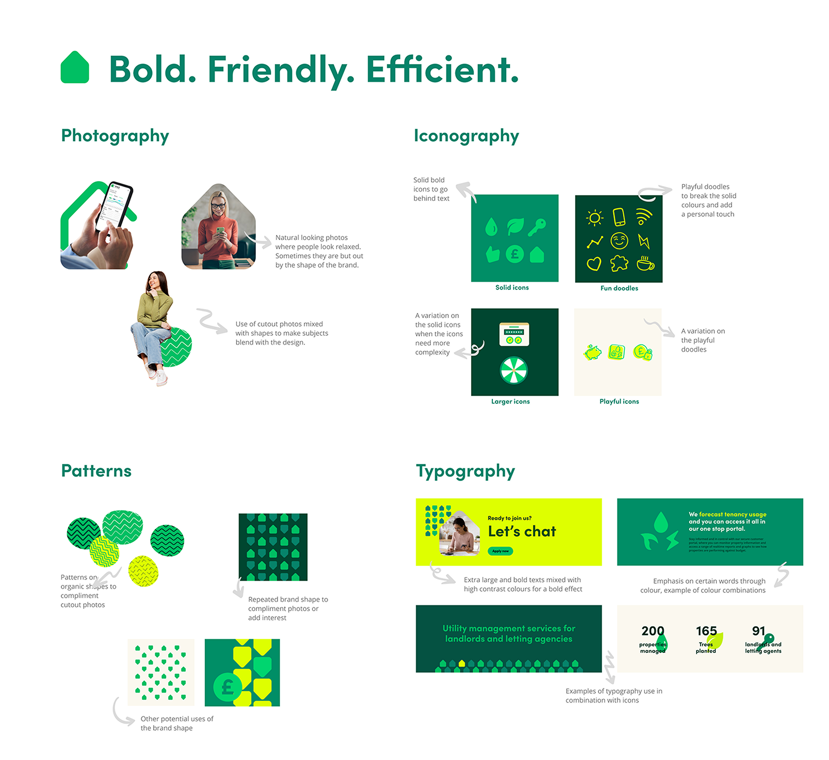
I started off by defining 3 words that would sum up the briefing of the client and how they wanted their brand to be perceived. Those words created the right creative starting point to start playing with the typography, iconography, photography, patterns and assembling a couple of banners to see how they would come together. This served to convey to the client my vision for the UI.
UI Design
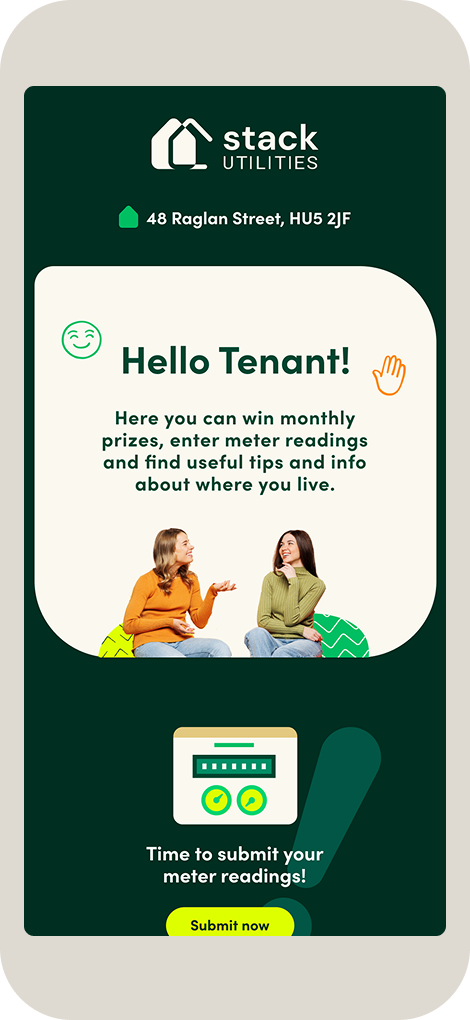
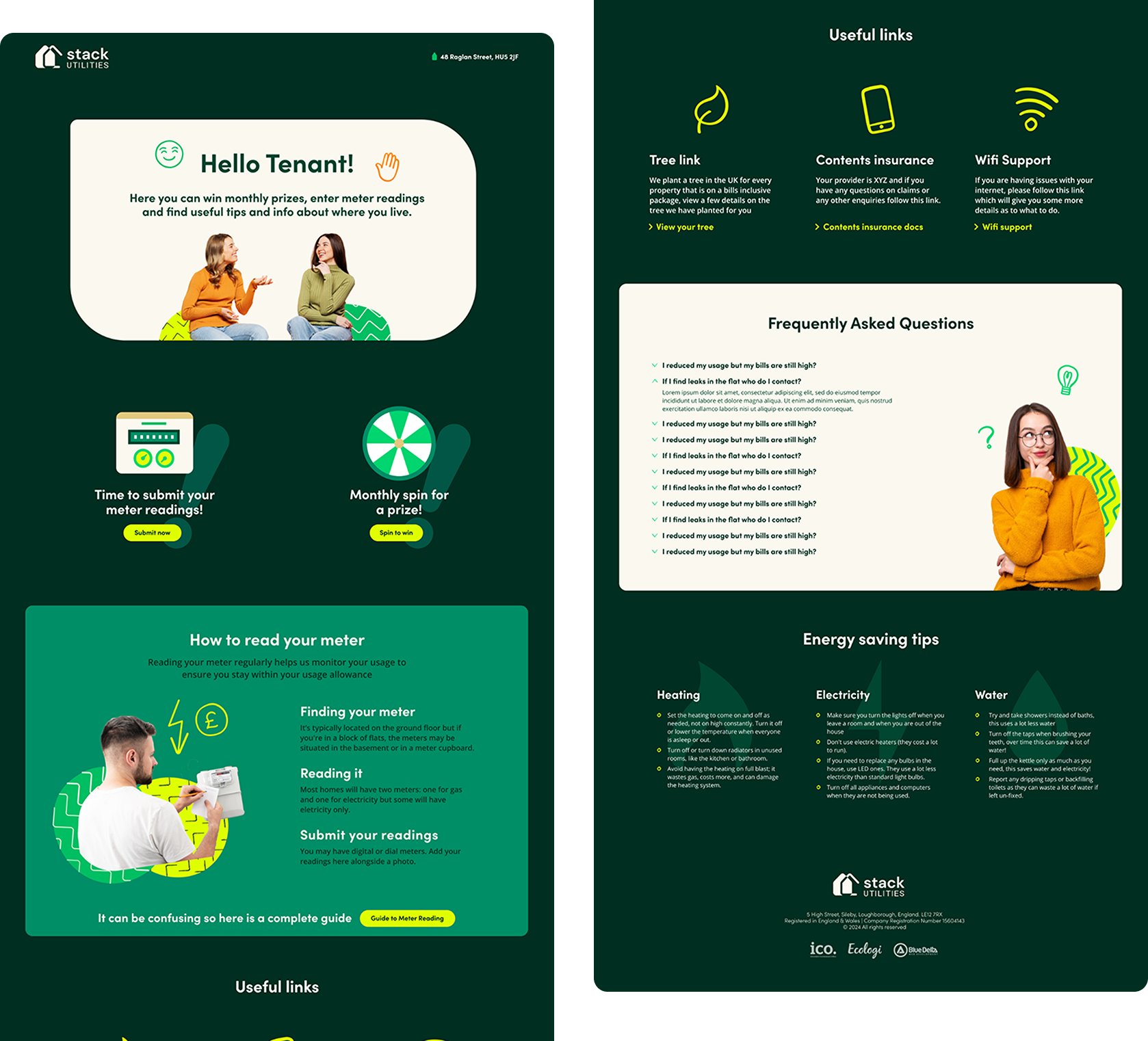
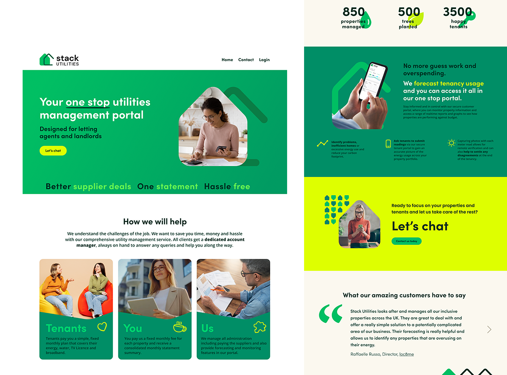
With a green light I then started assembling the Homepage and Tenant Portal, the central pages for my client’s business. The main objective was to make it clear the advantages of working with them over competitors and have straight forward call to actions.
The implementation was done by a company that had their own CMS, the assets were designed with the idea that it should work on their system. The handover was done via Zeplin and I made sure that all styles, variants, components and images were correctly defined for easy implementation.