Design thinking applied to a unique voice-driven device, helping users perform tasks hands-free
The Challenge
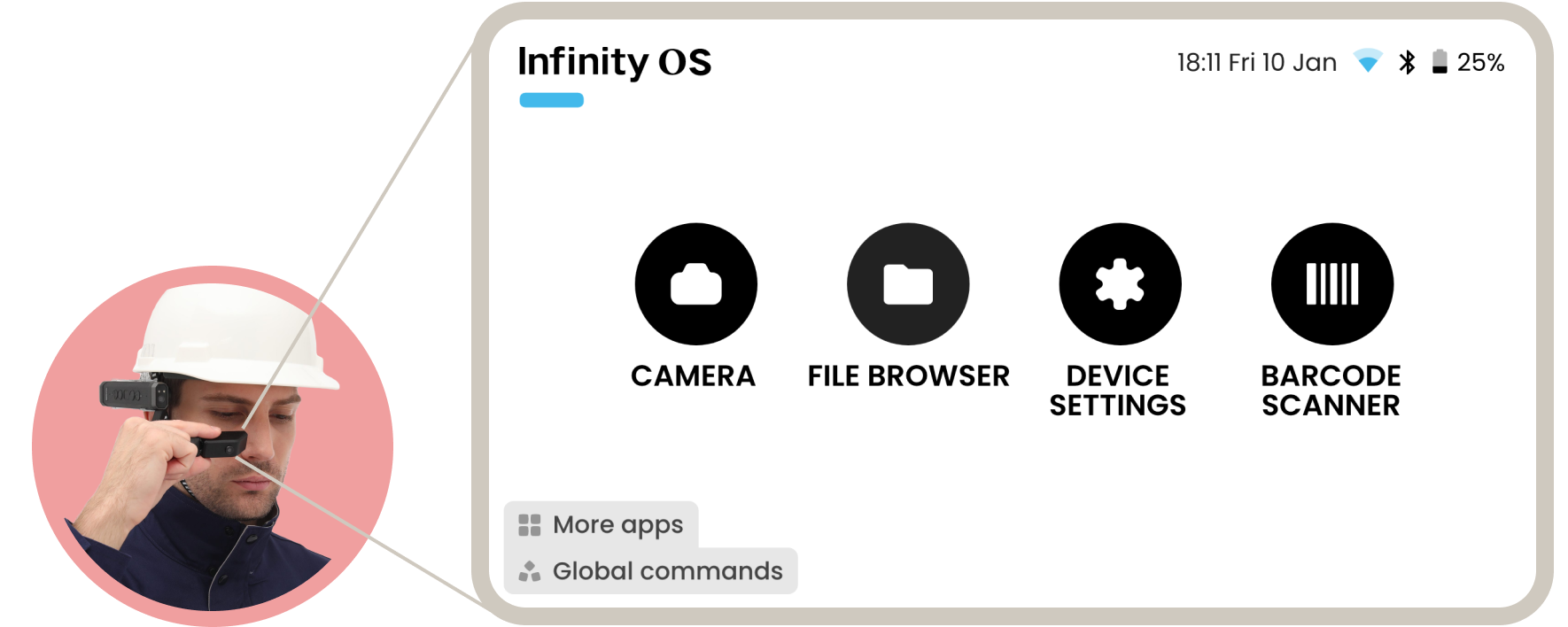
The main challenge was to create a user experience that makes this new unique hands-free device intuitive and enjoyable to use. As a productivity product for industries where workers are required to use their hands, this device allows them to, purely via voice, access documents, remotely call experts or take photos and videos of what they see.
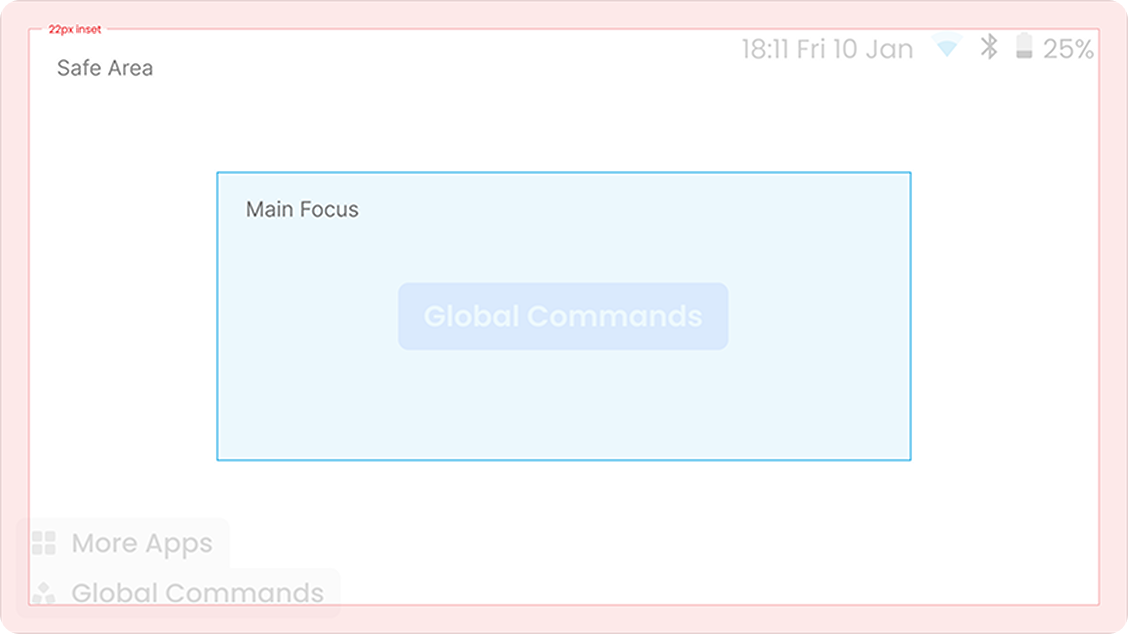
The nature of this voice driven experience required a “say what you see” approach, with voice commands that needed to be short and tested to evaluate recognition. We had to be strategic about the realstate of the screen, optimising the amount of elements and focusing main actions at the center and supplemental navigation on the bottom left corner, hiding away after a few seconds to be as unobtrusive as possible.
The design system
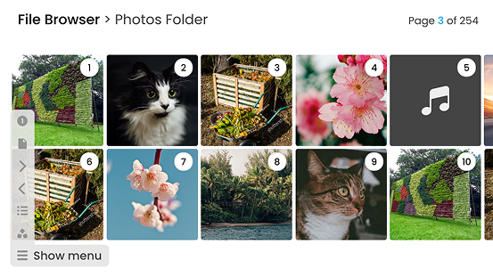
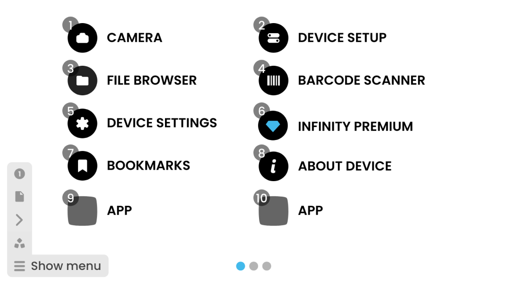
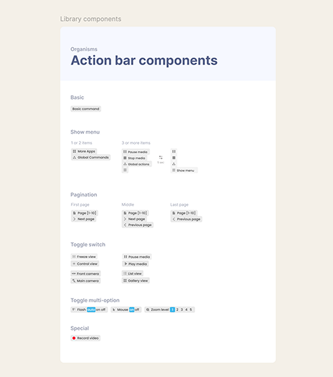
Navigation solutions had to be thought through considering the android system integration challenges and easy to use for users presented with this new experience. A shared menu was the way forward. It contained components; such as pagination, global commands and toggles; that could be used depending on the application. Easy to maintain from a development perspective and created a reliable experience across the device.
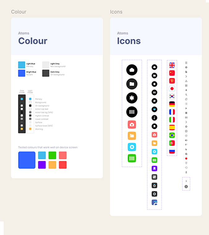
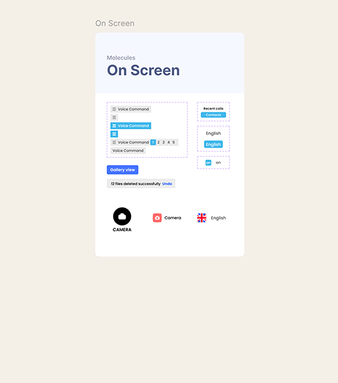
In terms of methodology, I came across the Atomic design concept by Brad Frost, which is an approach to creating design systems. Here is a snippet of how I used it in this project.
 Atoms
Atoms
 Molecules
 Organisms
The process
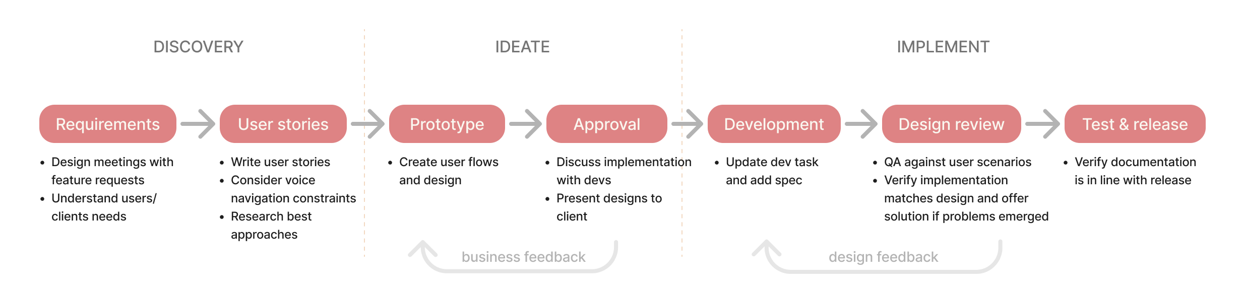
Our team used the Agile methodology. As the lead designer, at the start of this project, I defined how the design processes would integrate with development and testing withing the sprints.
Designing a voice driven keyboard
A lot had to be considered when designing this, but more crucially: combining ease of use and precision. A combination of dictation - somewhat low precision but quick - and NATO alphabet - precise but cumbersome, was a good fit but the challenge was to display both solutions on a small screen. It became clear that a design where the user could use both and both would affect the input was the best solution..
Previous implementation
The keyboard was originally designed to make use of headtracking seeing 5 items at a time, which was great for scalability and using the solution for other purposes, but it limited what the user could see at any given moment.
A better solution
Sometimes going back to basics is the best way forward. An interface the user is more used to and where they can see all the commands available at once was the winner design.